Vermeer’s Ultramarine
The blue that runs through Vermeer’s paintings was ground from lapis lazuli, a stone mined in the mountains of Afghanistan and worth more than any other pigment on a seventeenth-century palette. Here is where natural ultramarine came from, how it was made, and what modern examinations have found it doing beneath the surface of his pictures.
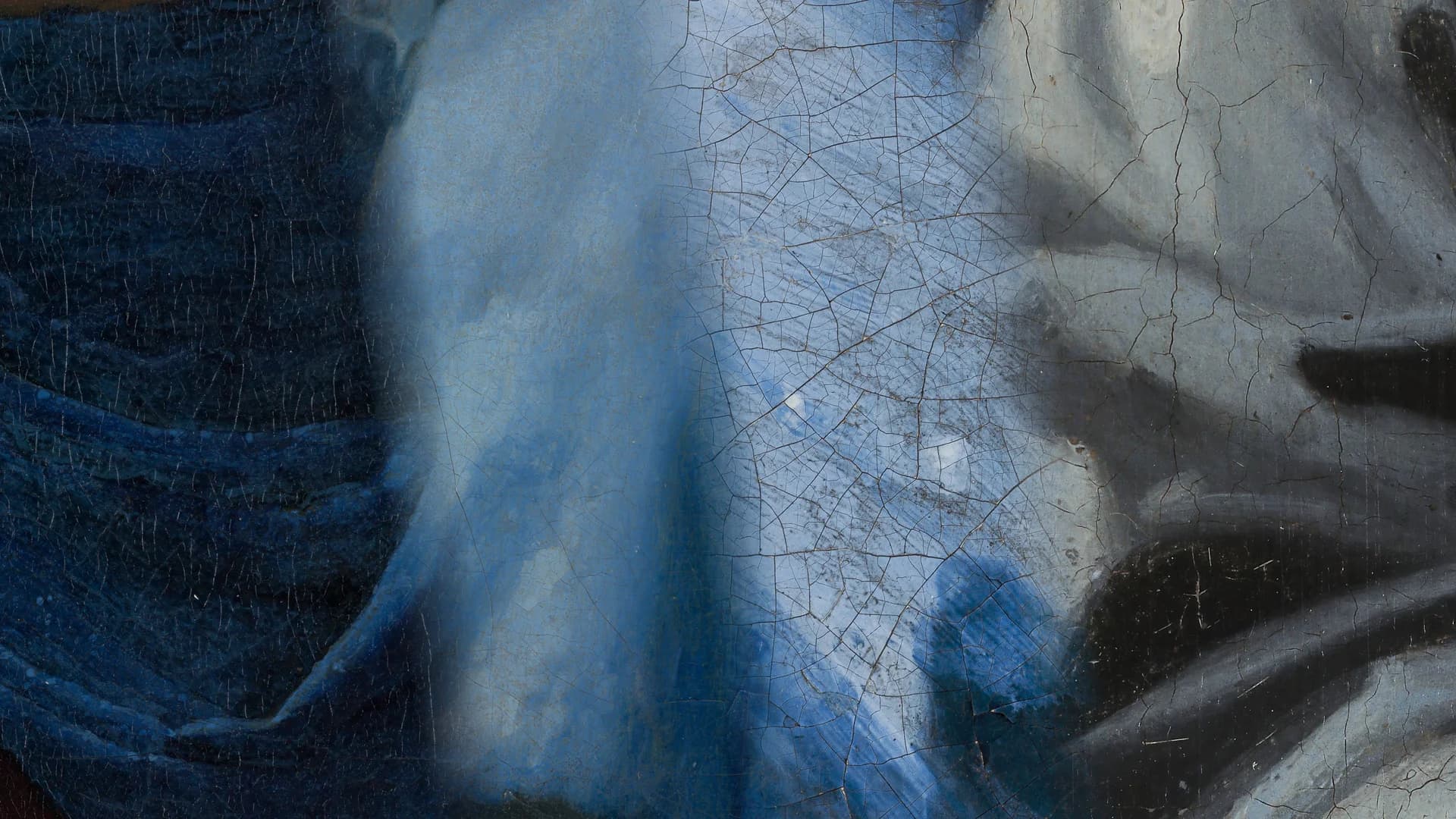
A stone from beyond the sea
The blue in Vermeer’s paintings began as a rock. Natural ultramarine was ground from lapis lazuli, a semiprecious stone whose only significant source in the seventeenth century lay in the mountains of Badakhshan, in what is now northeastern Afghanistan. From there the stone travelled to Venice, the port through which it entered Europe, and that journey is preserved in the pigment’s name: ultramarine, from the Latin ultramarinus, the blue from beyond the sea.
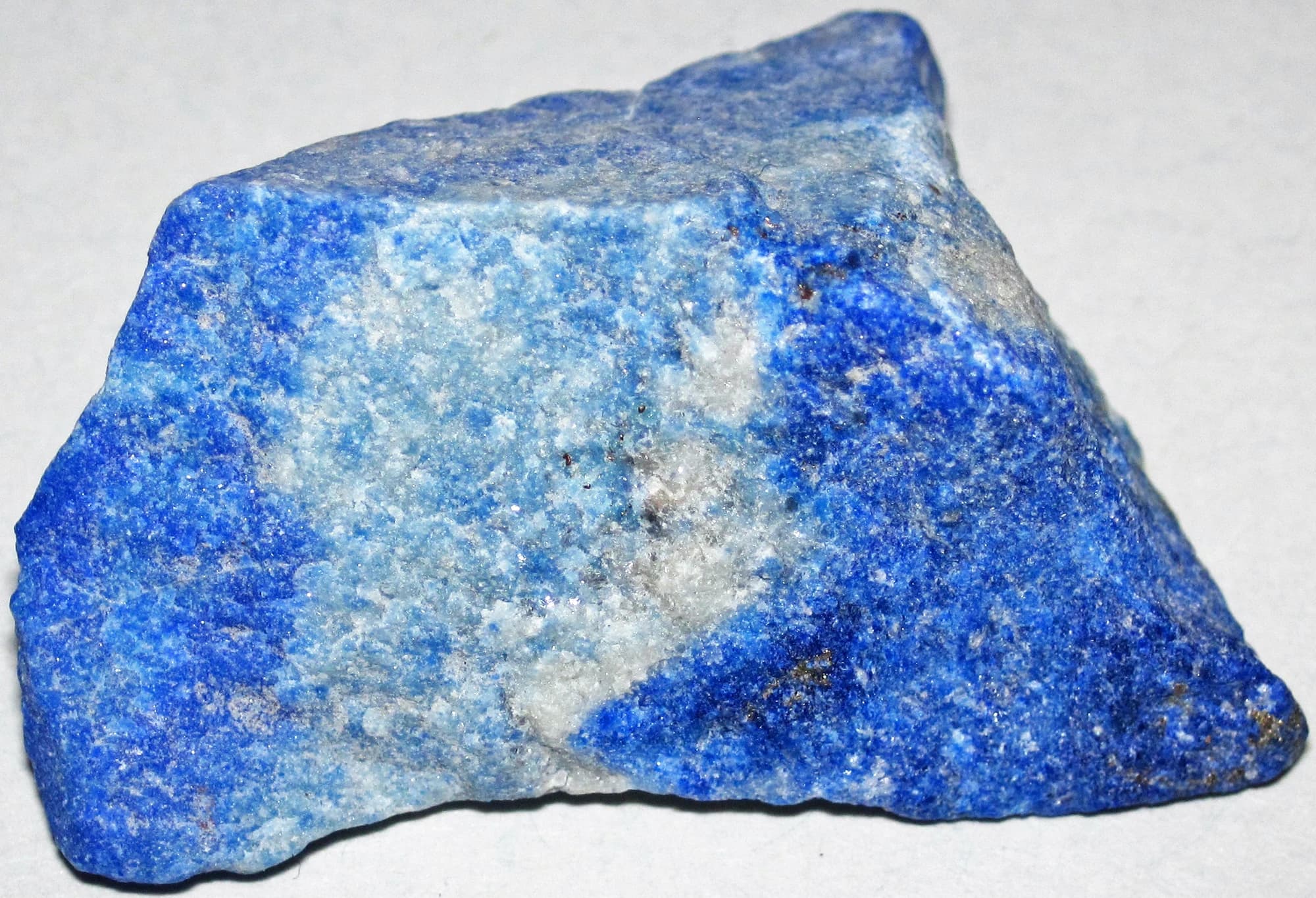
The stone itself is not pure blue. The colouring mineral, lazurite, grows together with white calcite and brassy pyrite, and the proportion of blue varies from stone to stone. Cennino Cennini, the Florentine painter whose workshop handbook Il libro dell’arte is the fullest early account of the craft, advised taking the stones that contain the most blue, and pounding them in a covered bronze mortar so that none of the precious powder could fly away.
Simply grinding the stone, though, gives a greyish powder, the blue dulled by all the colourless minerals ground up with it. Turning lapis lazuli into ultramarine required a further process, and it is that process, as much as the distance the stone travelled, that made the pigment so costly.
Making the pigment
The method in use across Europe from the fourteenth century onwards was known as the pastello treatment. The ground stone was worked into a dough of melted pine resin, mastic and wax, and the mass was left to rest for days or weeks. It was then kneaded in rainwater or a weak solution of lye, and the fine blue particles of lazurite drifted out into the liquid while the impurities stayed behind in the dough. The first extraction gave the deepest, purest blue. Each repeat gave a weaker one, down to a final pale grey-blue known as ultramarine ash.
Ultramarine blue is a colour noble, beautiful, and perfect beyond all other colours, and there is nothing that could be said of it but it will still exceed this (praise).
Cennini wrote that with this colour, together with gold, everything should be resplendent, whether on walls or panels. The market agreed with him for centuries. A single distant source, a long trade route and a slow, low-yield refining process made natural ultramarine by far the most expensive blue pigment available in the seventeenth century, and its presence may even have raised the value of a painting in the eyes of collectors. Most Dutch painters reserved it for final touches over cheaper blues such as azurite, smalt or indigo, when they used it at all.
Ultramarine throughout the palette
Vermeer did not treat it as a colour for final touches. The first systematic study of his materials, made by the German chemist Hermann Kühn in the 1960s, sampled thirty paintings and found natural ultramarine again and again: in tablecloths and curtains, jackets and upholstery, and mixed into passages that do not read as blue at all. Painters of the time added small amounts of ultramarine to cool a white or to turn a yellow green, and Vermeer did so habitually, in shadowed walls, in daylit plaster, in the greens of foliage and cloth.
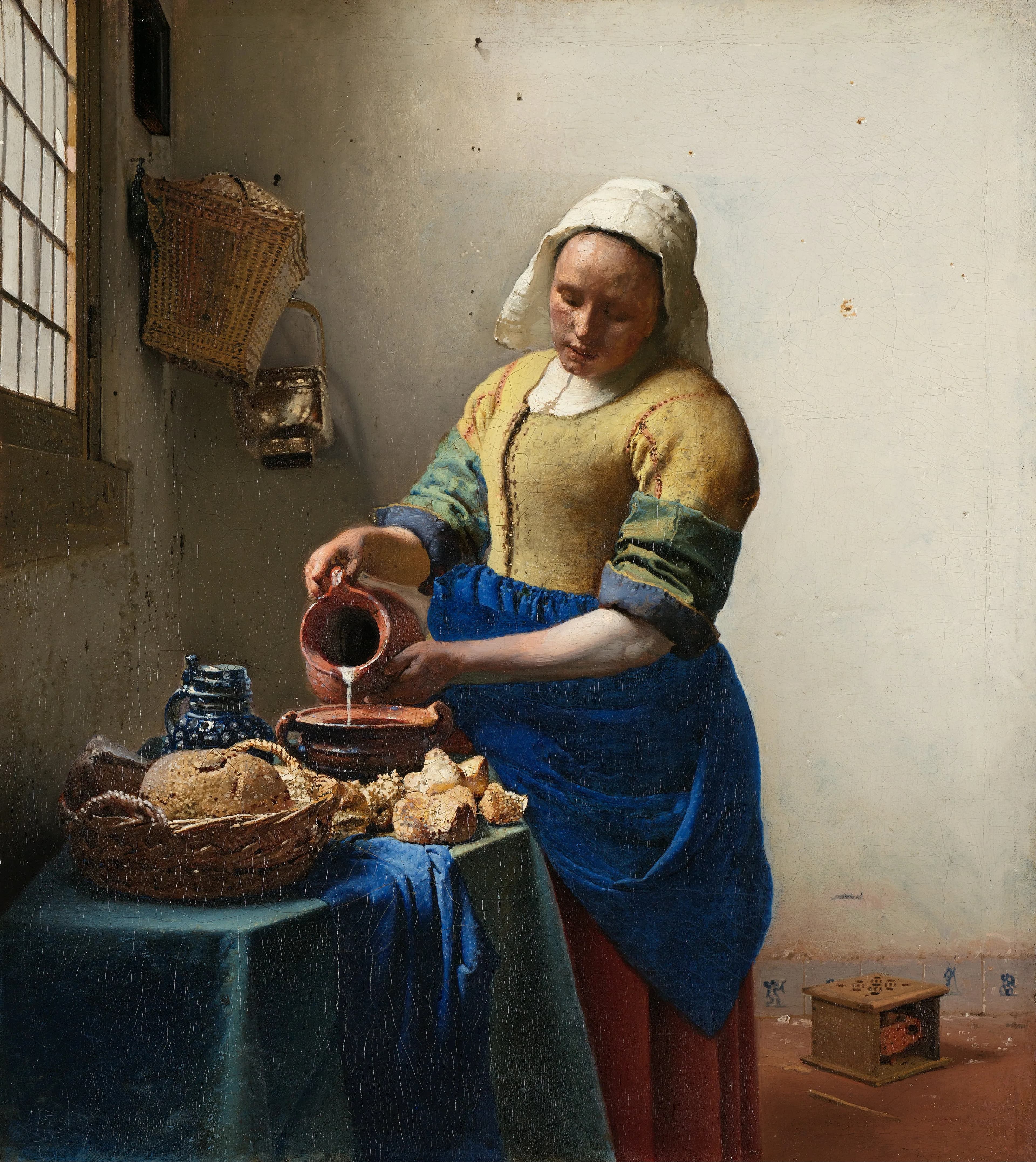
The Milkmaid shows how early that habit set in. Kühn identified natural ultramarine in its blues in the 1960s, and when the Rijksmuseum re-examined the painting in 2022, ahead of the great Vermeer exhibition of 2023, scanning revealed the speed underneath the stillness: a thick, hastily applied line of black paint beneath the milkmaid’s left arm, part of a rapid first sketch in lights and darks, and two abandoned ideas, a jug holder and a fire basket, painted out of the final picture. The blue surface we see was built over that fast beginning, as told in the story of the 2022 examination.
Blue beneath other colours
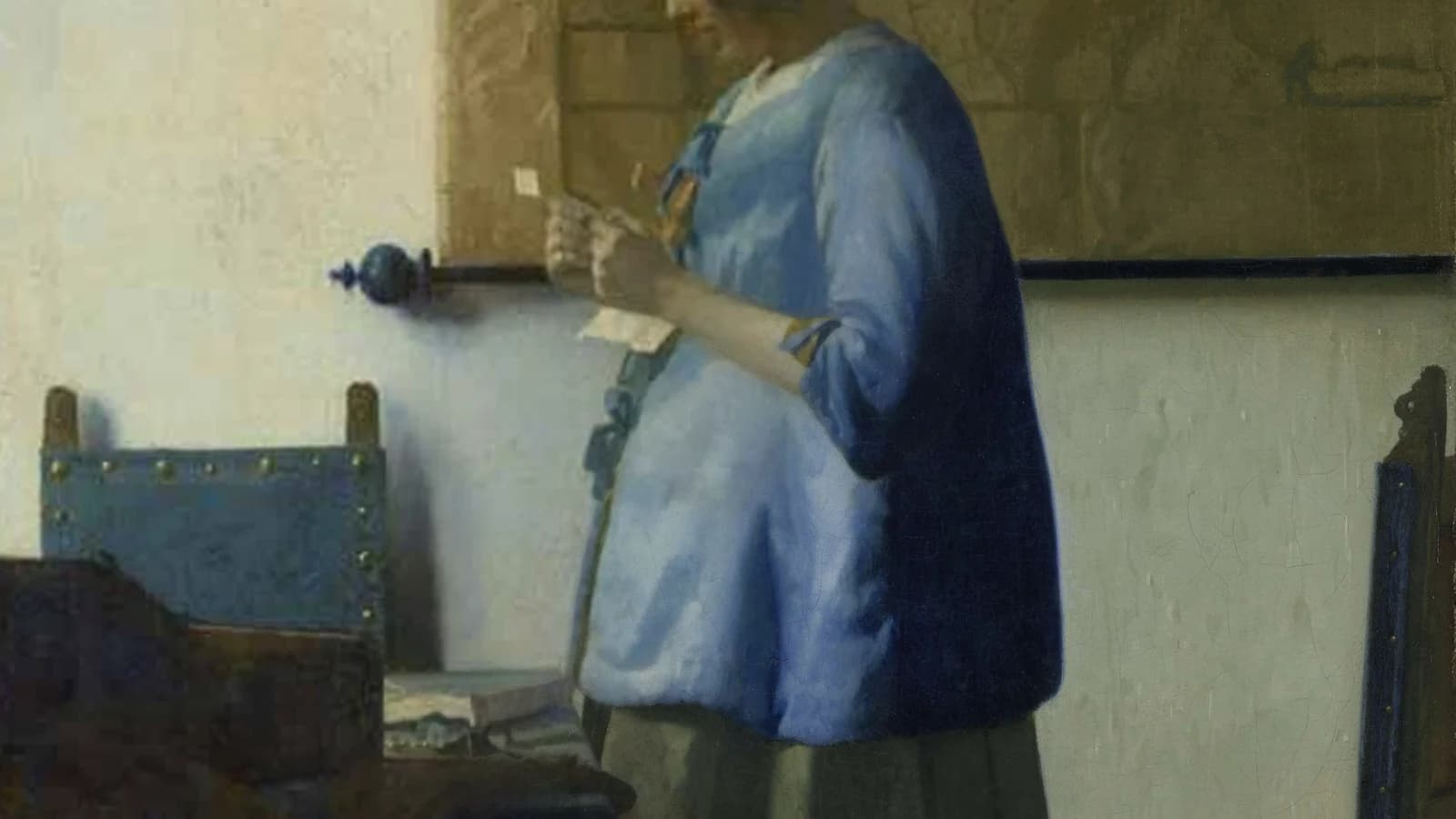
The painting that carries his blue most openly is Woman in Blue Reading a Letter. When the Rijksmuseum restored it in 2010 and 2011, conservator Ige Verslype removed a heavily yellowed varnish, and the cool blues returned with a shift she described as quite dramatic. Only once the varnish was gone did it become apparent that Vermeer had used two different shades of blue for the jacket and the chairs, a distinction the discoloured varnish had flattened into one.
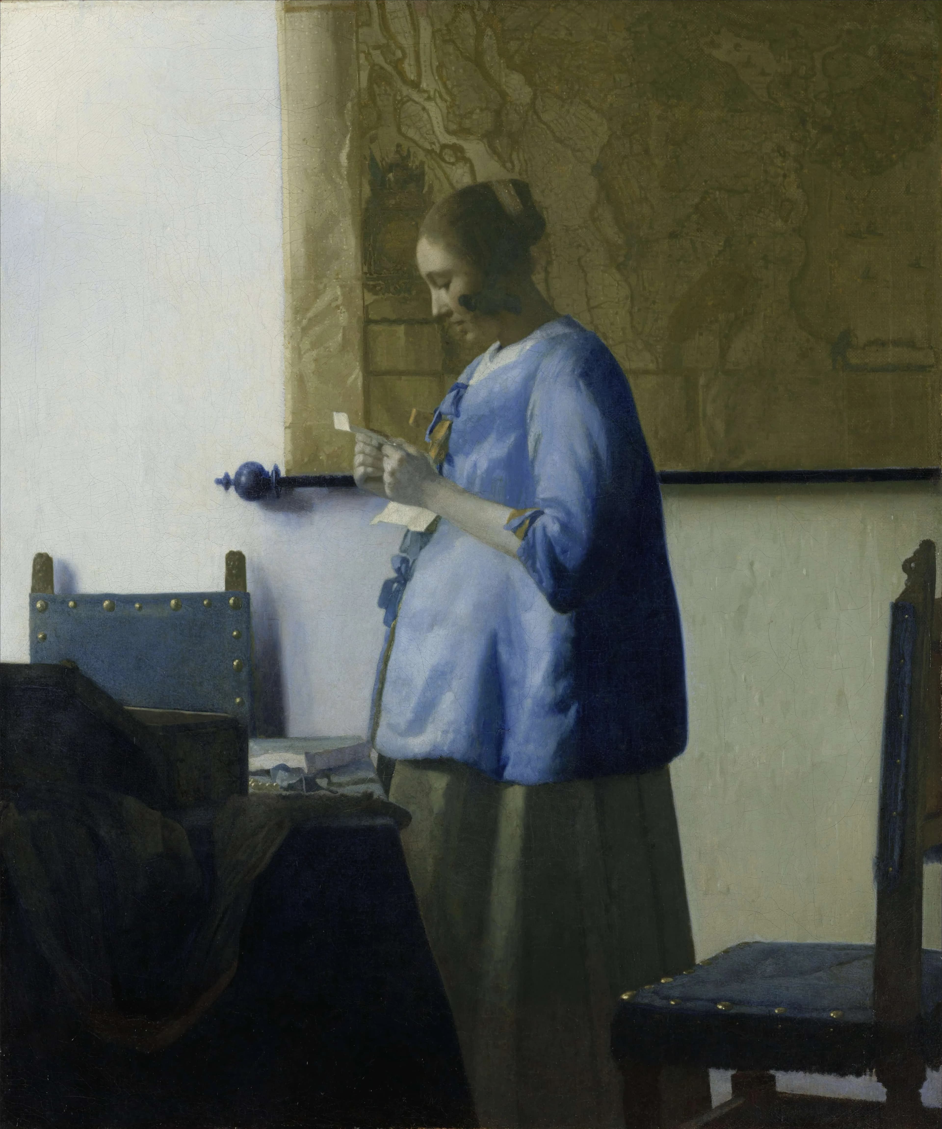
The restoration also showed how the blue was built. Beneath the ultramarine of the jacket Vermeer had first laid a copper-green undercoat, a hidden layer that lends the colour above it extra depth. Verslype called the discovery the greatest surprise of the project.
The blue does not stop at the jacket. Cleaning revealed that the wall below the right-hand chair was originally a vibrant purplish blue, later painted over by another hand in the greenish grey of the wall above it. The whole treatment, including the string of pearls that turned out to be a later addition, is told in the story of the 2011 restoration.
The headscarf of Girl with a Pearl Earring
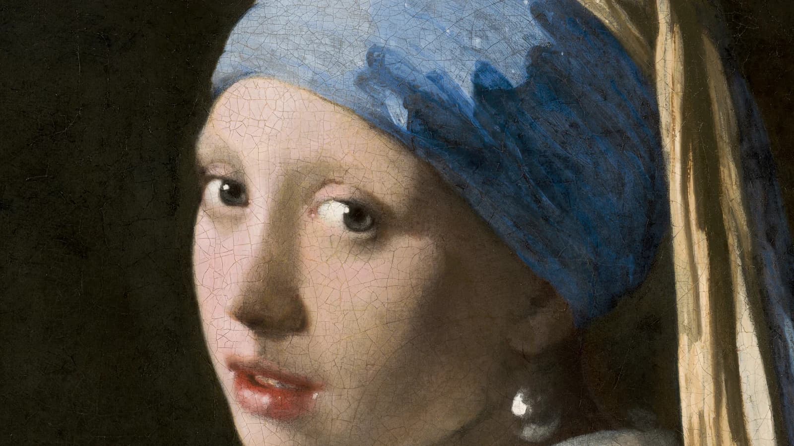
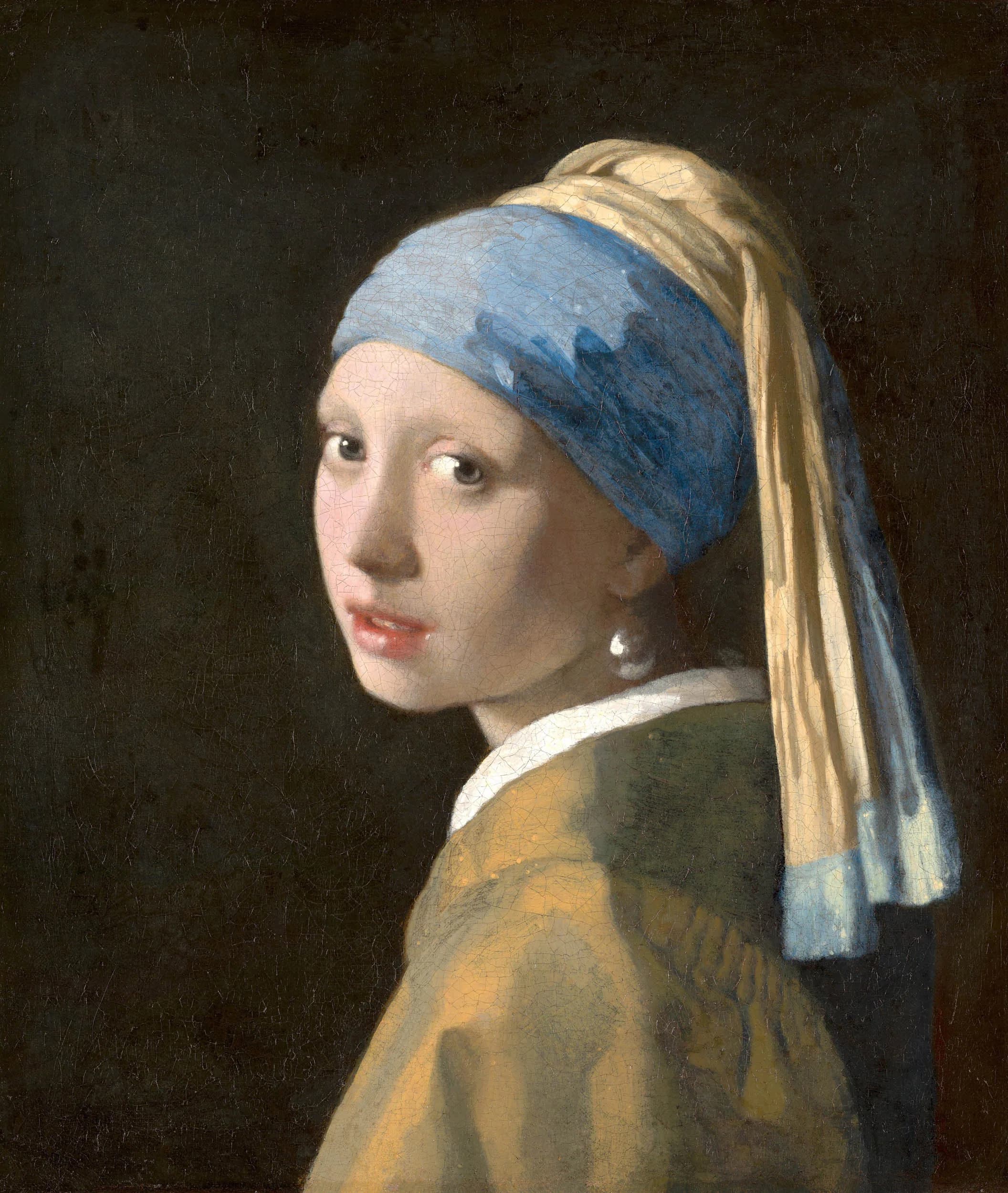
The closest look yet at Vermeer’s ultramarine came in 2018, when the Mauritshuis examined Girl with a Pearl Earring in the Girl in the Spotlight project. Analysis of microscopic paint samples from the headscarf showed an unusual abundance of bright blue lazurite particles: Vermeer had bought high-quality ultramarine, from the best extractions of the pastello process. Study of the sulphur inside those particles at a synchrotron suggested something further, that the pigment had been prepared at least in part from stone first heated until red hot, a step some historical recipes recommend because it makes the rock easier to grind and the blue more intense.
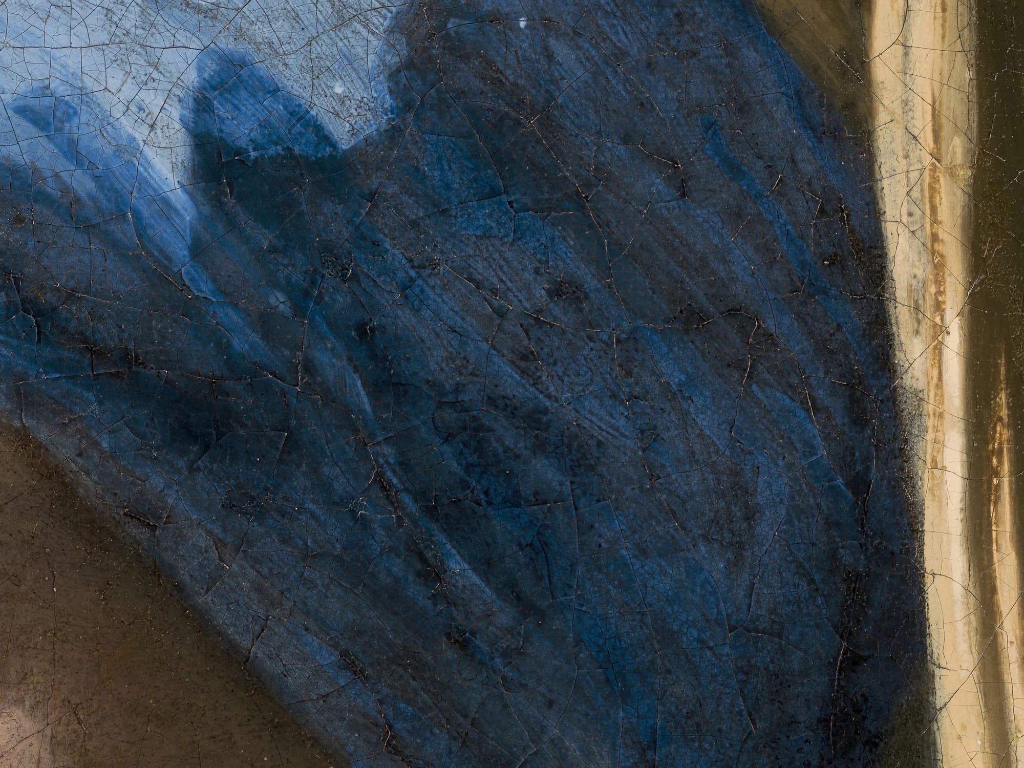
The same study explains why the shadow side of the headscarf looks patchy today. Vermeer mixed large amounts of chalk into the ultramarine there, and the paint has degraded around it. The researchers reconstructed how the headscarf originally read: an opaque light blue in the lit zone, a brighter opaque blue in the middle, and a deep blue-green glaze in the shadow, a range now largely lost.
The full examination, from the pigment trade map to the eyelashes found under infrared, is told in the story of the 2018 examination.
The cost and the painter’s means
All of this was paid for from a modest household. The Rijksmuseum puts it plainly: although Vermeer was far from wealthy, he often used this expensive raw material in his paintings. The economic historian John Michael Montias, who reconstructed Vermeer’s finances from the Delft archives, documented how thoroughly they collapsed after 1672, the Dutch “disaster year” of French invasion and a fallen art market; after the painter’s death in 1675 his widow, Catharina Bolnes, petitioned for relief from his debts.
How a painter in that position kept buying the most expensive pigment in Europe is one of the questions behind Montias’s best known finding. The Delft collector Pieter Claesz van Ruijven, whose heirs owned some twenty Vermeers, lent the painter money and appears in the documents as something close to a standing patron. Montias proposed that this relationship gave Vermeer a steadiness few Dutch painters had, and scholars since have read the unbroken supply of ultramarine as a sign of the same arrangement. That reading is an inference from the documents rather than a fact in them, but the pigment itself is hard evidence of one thing: the blue kept coming.
Ultramarine sickness
Natural ultramarine was prized for permanence. Organic blues fade; in Girl with a Pearl Earring itself, the background was once a deep green glaze of indigo and weld, and light has since dimmed it to the dark field we see today, while the mineral blue of the headscarf above it is still recognisably blue. But ultramarine-rich paint has a slow disease of its own. Conservators have long described a greying and blanching of such passages as “ultramarine sickness,” and recent research points to the pigment itself as the agent: under ultraviolet light, ultramarine catalyses the breakdown of the oil that binds it, and the damaged paint scatters light into a dull grey-blue.
Vermeer’s paintings hold both outcomes. The shadow of the girl’s headscarf has gone patchy where chalk thinned the ultramarine, and the once purplish blue wall of Woman in Blue Reading a Letter was dulled and overpainted long before modern conservators reached it, while the apron of the milkmaid has kept its bright blue for three and a half centuries. The stone from Badakhshan was a gamble on permanence, and in most of Vermeer’s pictures it is a gamble that paid off.
Two of the examinations that recovered these blues have stories of their own.
Notes
- 1.In the seventeenth century lapis lazuli was mined in what is now Afghanistan and imported into Europe through Venice. See Vandivere, van Loon et al., “Out of the blue: Vermeer’s use of ultramarine in Girl with a Pearl Earring,” Heritage Science 8, 25 (2020).
- 2.Cennino Cennini describes selecting the stones “which contain most of the blue colour” and pounding them “in a covered bronze mortar, that the powder may not fly away” in chapter 62 of Il libro dell’arte, here in the 1899 English translation by Christiana Herringham, The Book of the Art of Cennino Cennini, pp. 47–48.
- 3.The pastello treatment, in use from the fourteenth century onwards, and the declining grades down to ultramarine ash are described in “Out of the blue,” Heritage Science 8, 25 (2020). Cennini gives a full recipe: pine resin, mastic and new wax melted together, kneaded with the ground stone for days with oiled hands.
- 4.Both the quotation and the advice that “with this colour, together with gold … let everything be resplendent” open chapter 62 of Il libro dell’arte, in Herringham’s translation, The Book of the Art of Cennino Cennini, p. 47.
- 5.“Ultramarine was by far the most expensive blue pigment available in the seventeenth century,” and its presence may even have enhanced a painting’s value for collectors: “Out of the blue,” Heritage Science 8, 25 (2020), introduction.
- 6.Hermann Kühn, “A Study of the Pigments and the Grounds Used by Jan Vermeer,” Report and Studies in the History of Art 2 (National Gallery of Art, Washington, 1968), pp. 155–202. Kühn sampled thirty paintings then attributed to Vermeer; his study and its afterlife are discussed in the RKD study Counting Vermeer.
- 7.Seventeenth-century painters used ultramarine “not only … for blues, but also in mixtures,” with yellows to make green or in small quantities with white paint, a practice documented across Vermeer’s pictures. See “Out of the blue,” Heritage Science 8, 25 (2020), introduction.
- 8.The 2022 examination of The Milkmaid with Macro-XRF and reflectance imaging spectroscopy, including the hastily applied line of black paint beneath the left arm and the abandoned jug holder and fire basket, was announced in the Rijksmuseum press release “Rijksmuseum reveals major discoveries on Vermeer’s painting The Milkmaid” (8 September 2022).
- 9.Ige Verslype, “The restoration of Woman in Blue Reading a Letter by Johannes Vermeer,” The Rijksmuseum Bulletin 60 (2012), no. 1, pp. 2–19. The removal of the yellowed varnish revealed “the intense blue hues,” a shift “quite dramatic” in the shadowed jacket, and made it “quite apparent that Vermeer had used two different shades” of blue.
- 10.Vermeer’s laying of a copper-green undercoat beneath the ultramarine to deepen it, which Verslype called the “greatest surprise” of the work, was announced in the Rijksmuseum press release “‘Woman in Blue Reading a Letter’ fully restored by the Rijksmuseum” (29 March 2012; the museum’s original page is offline, archived at the Wayback Machine).
- 11.During cleaning “it also became apparent that the area of the wall below the chair was originally a vibrant purplish blue, and that it had been painted over in the greenish-grey colour of the wall above the chair at a later date”: Verslype, The Rijksmuseum Bulletin 60 (2012), p. 12.
- 12.The abundance of bright blue lazurite particles in the headscarf and the synchrotron sulphur K-edge XANES evidence that the pigment was prepared at least in part from heat-treated lapis lazuli rock are reported in “Out of the blue,” Heritage Science 8, 25 (2020).
- 13.The same study attributes the patchy appearance of the shadow side of the headscarf to paint degradation probably related to the large amounts of chalk mixed into the ultramarine there, and reconstructs the three original zones of blue. See “Out of the blue,” Heritage Science 8, 25 (2020).
- 14.“Although Vermeer was far from wealthy, he often used this expensive raw material in his paintings,” notes the Rijksmuseum in “10 things about Vermeer’s Woman Reading a Letter”.
- 15.John Michael Montias reconstructed Vermeer’s finances from the Delft archives, including the collapse after 1672 and Catharina Bolnes’s petition after his death, in Vermeer and His Milieu: A Web of Social History (Princeton, 1989); see also his “Vermeer’s Clients and Patrons,” The Art Bulletin 69, no. 1 (1987), pp. 68–76.
- 16.Montias identified Pieter Claesz van Ruijven as Vermeer’s probable standing patron in “Vermeer’s Clients and Patrons,” The Art Bulletin 69, no. 1 (1987). The reading of Vermeer’s uninterrupted ultramarine supply as evidence of that patronage is discussed in the RKD study Counting Vermeer.
- 17.The background of Girl with a Pearl Earring was found to be a once-green glaze of indigo and weld, both now faded by light: Beltran, van Loon et al., “Fading into the background: the dark space surrounding Vermeer’s Girl with a Pearl Earring,” Heritage Science 7, 93 (2019).
- 18.On the mechanism of “ultramarine sickness,” see Cato et al., “Analysis of the photocatalytic activity of ultramarine blue pigment,” Polymer Degradation and Stability (2017), which identifies UV-driven degradation of the oil binding medium, rather than acid attack, as the likely primary cause, and notes that the ultramarine of The Milkmaid has kept its original bright blue.